Layer by layer, color by color, research by research: the French artist details his collaboration with Van Cleef & Arpels
Van Cleef & Arpels Les Petites Superstitions
When Alexandre Benjamin Navet rifled through the archives of Van Cleef & Arpels, he journeyed through the marriage between Alfred Van Cleef, son of a lapidary craftsman and diamond broker, and Estelle Arpels, daughter of a dealer of stones used for jewelry, in 1895 to the point the Maison came into being at 22 Place Vendôme in Paris in 1906.
In 1916, the Maison designed their Touch Wood pieces, the compendium of jewelry made of wood and precious materials as a nod to good-luck charms. In the archives, the publicity for the series unfurls in a poster titled Les Petites Superstitions with the size and style of a playing card. Two women stand side by side: the left one inspects the Touch Wood ring of the right woman, placing her hand on her right hip while wearing a grin.
Acting as a background, the wallpaper and window curtains share the lines the size of a rod with white spaces to fill the gaps. The wallpaper’s palette absorbs green in the shade of forest, the window curtains wear orange in the hue of sunset, and the left woman wears a dress, whose design amalgamates the color and style of the wallpaper and windows.
From this poster, Navet portrayed the Maison’s archives using strokes of green, red, yellow, blue, and pink over beige curtains when he was called earlier this year to create works for the Van Cleef & Arpels boutique in Via Monte Napoleone 10 in Milan. Inside this store, Navet explored how flora and nature intertwine with the Maison’s necklaces, pendants, bracelets, rings, earrings, cufflinks, watches, and clips, celebrating the new Frivole collection.
Van Cleef & Arpels collaboration with Alexandre Benjamin Navet
In each of the jewelry cases, Navet’s illustrations sheltered in a material resembling cardboard. The molds of anfora, oinochoe, hydra, and canopic jar from the ancient Etruria mirrored the vases made of brushes of green, gold, silver, pink, and blue; rhombuses, diamonds, crescents, and eclipses decorated the canvas in pink, blue, green, orange, and yellow; and strands of flowers were nestled inside them.
If not cardboard, ceramic in a cylinder acted as the vases with drawings of stems and leaves on the surface to continue the illustrations on the strands of flowers inside them. Drawn from the collaboration, Navet researched on flora, a first in his art.
«Flowers were at the core of this collaboration, and creating the visual language inspired by flowers, blossoms, and nature was new for me. Since incorporating flora and nature into my drawings was a territory I had not yet explored, I had gathered information from the Maison’s archives and collected hardbounds and paperbacks about flora and nature to read up on the functions and symbolisms of flowers in nature. The challenging part may have been interpreting these functions and symbols of flowers into illustrations since flowers have a variety of definitions, depending on which culture or country one is located. From this perspective, we started with a mood board to garner ideas, but not allowing ourselves to be restricted by this blueprint and without imposing any specific messages on what the flowers, vases, and illustrations would be about».
The meaning of flowers
Flowers in Spring helmed the research and interpretation of Navet which included violet crocus, yellow daffodils, red tulips, white lily of the valleys, and pink hyacinth. Inside the boutique of Van Cleef & Arpels in Milan, books in hardbound were hidden in the nooks of jewelry and watch cases and tables which anchored the drawings of flowers.
To echo Navet’s recognition towards the differences in the definitions of flowers according to culture and or country, Living Language writes that in Italy, where Navet installed his exhibition, yellow may signify betrayal, glory, and success; orange serves as a celebration of birthday and anniversaries as a symbol of joy, happiness, and accomplishment; pink associates itself with weddings and admiration; red flashes perseverance, continuity, and immortality; purple for modesty, generosity, and humility; turquoise as a shade symbolizes achievement for those who involve themselves in the field of arts and sciences and celebrants of degrees and diplomas; and green represents hope, joy, and optimism.


Lampoon in conversation with Alexandre Benjamin Navet
Navet emulates these shades in his art. «I have a bond with vivid colors as these shades and my visual style are interconnected. I never mix them to create a juxtaposition. The colors have their own character – they are independent protagonists. When I use colors, I want to use them for what they are. For instance, orange for forms, yellow for intensity, and blue for eclipse», states Navet during his call with Lampoon.
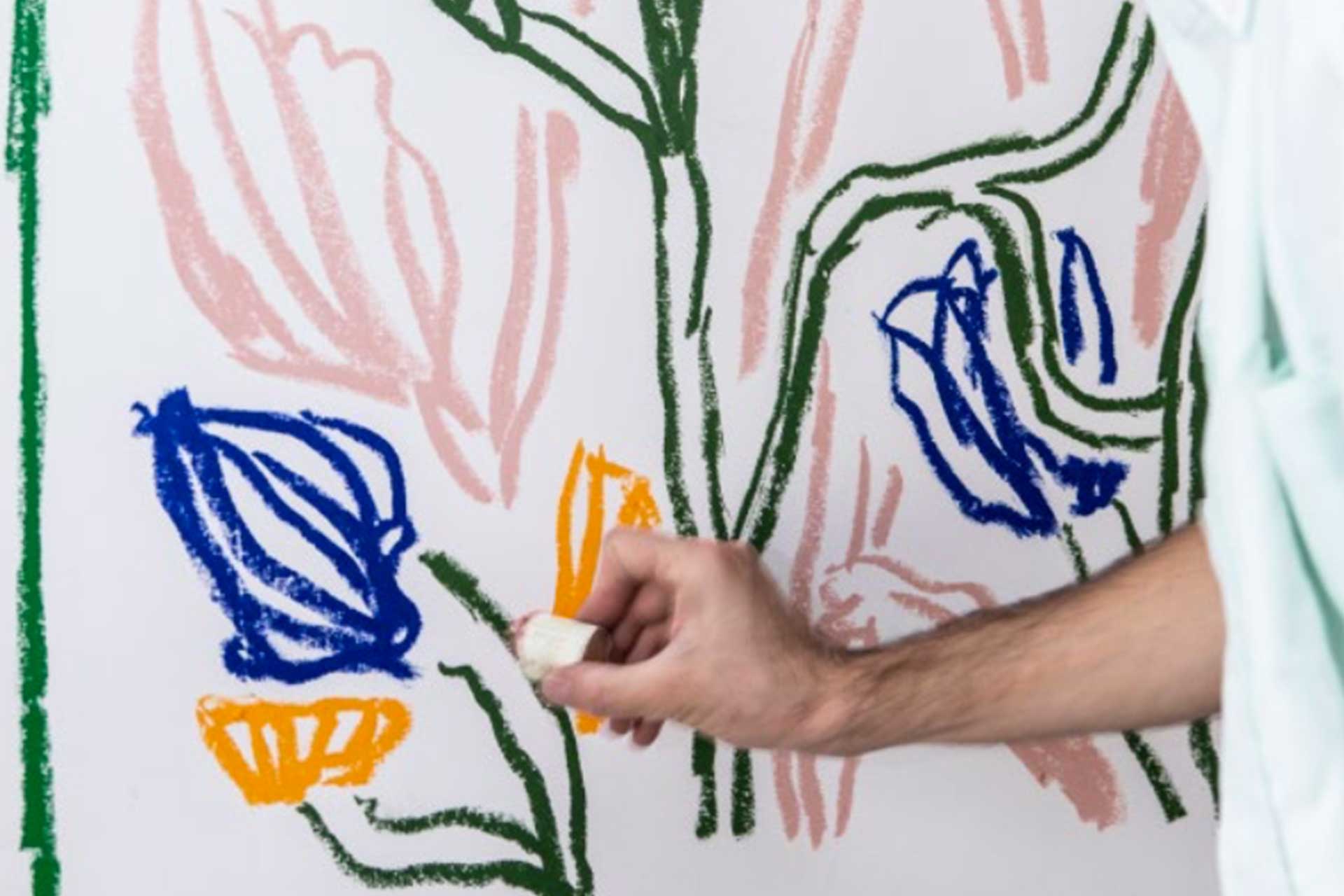
«Whether it is a pigment, watercolor, or colored pencil, I search for highly pigmented colors as they create an impression, and the way I draw comes layer by layer, just as what I did with my collaboration with Van Cleef & Arpels. We started having the library decor, then the curtains, the cushions, the carpet, the books, the vases, and the wallpapers». In the lounge area of Van Cleef & Arpels in Milan, the cream carpet lost its prototype when Navet painted and intertwined the stems, leaves, and petals of tulips and daffodils across the canvas in blue, pink, orange, and green.
Two chairs and two armchairs in cream and gray cradled the cushions with Navet’s illustrations of two to four flowers per throw pillow in green, pink, blue, orange, red, and white. In the heart of the area, a painting in a white frame depicted pinwheels in the shape of flowers and in green and blue with thin petals in green and stems and leaves in blue against a yellow background. Beyond the frame, the wallpaper duplicated the three green leaves forming a letter V.
«As for the pigment and materials, I worked with mixed media – sometimes pastel and watercolor, sometimes the theories of interior design and other forms of media. It was interesting to witness how we employed colors, manipulated the pigments, translated my research on nature, flora, and the archives of the Maison into drawings. One may have felt as if they were walking in a sketchbook which has been my desire. By strolling through the images, the audience found and rediscovered new and past details».
Alexandre Benjamin Navet’s empty vases
Before the collaboration, Navet had – perhaps only – drawn empty vases with his designs. While one may think it conceives his perception of emptiness, Navet reinstates that vases without flowers sit far from being empty. «There is something that I love about objects, especially vases which have been a part of my everyday life since my childhood. The thinking that makes this type of object a treasure infiltrates the unexpectedness that it can tell or have a backstory. Sometimes, it does not have to be filled with flowers, water, or any other objects, but to be marveled at as it is. Empty vases are not empty».
To make his point, the artist excuses himself to snatch three vases. The first bears the aesthetics of Navet, but in deep colors of red, blue, yellow, and green, in the shape of hydra with diamonds and triangles peppered around the object an item the artist bought during his visit in one of the night markets in Milan. The second builds a circular opening until it narrows and whose colors pivot to yellow over drawings of what seems to be giraffes in black.
The third materializes into a cylinder with a backdrop in yellow and drippings in green, outlining the roots of a tree. «One is made by a friend, which I have in my studio to feel his presence even though he is not around, and another comes from my mother which she gave to me as a gift. All of these create experiences, defeating the definition of emptiness in an object being empty. For my collaboration with Van Cleef & Arpels, it was an immersive experience to step out of my comfort zone and begin to place items – in this case flowers – into my vases».
Alexandre Benjamin Navet artist
Multidisciplinary artist and art director currently living in Paris. Navet Graduated from ENSCI–Les Ateliers, the École nationale supérieure de création industrielle in 2011. In 2017 he was the Grand prize winner of the Design Parade Toulon – Van Cleef & Arpels. In 2020 he began a long term collaboration with the French Maison.